- Services
Services
At the intersection of design, engineering and marketing, where brand meets demand, we blend creativity with data efficiency to give your business an edge to thrive.
Product DesignProduct Design
From concept to reality, beautifully engineered.Product EngineeringProduct Engineering
Turning ideas into high-performance products.Services & Digital DesignServices & Digital Design
Smart solutions for seamless experiences.Advanced 3D SurfacingAdvanced 3D Surfacing
Sculpting perfection, down to every curve.Creative VisualizationCreative Visualization
Stunning visuals that captivate and inform.2D Configurator2D Configurator
Simplify choices with interactive 2D previews.3D Configurator3D Configurator
Explore, customize, and visualize in 3D.
Immersive CXImmersive CX
Engaging experiences that feel real.Product DocumentationProduct Documentation
Clear, concise, and user-friendly guides.Brand AssetsBrand Assets
Designing digital interactions that connect.Intelligent SalesIntelligent Sales
Data-driven tools to close deals faster.Micro Offshore DesignMicro Offshore Design
Global expertise, seamless collaboration.Managed ProductionManaged Production
From idea to execution, stress-free.Agency PartnerAgency Partner
Your behind-the-scenes white label creative powerhouse - Programs
Programs
Built to support different business stages, strategies, and growth needs.PartnerPartner
Ongoing design, engineering, and launch support for funded or scaling ventures.Corporate InnovationCorporate Innovation
Bring agility to enterprise with sprints, prototyping, and product acceleration.LaunchpadLaunchpad
Build and launch your new product or venture with our integrated team-on-demand.Small BusinessSmall Business
Tailored design and innovation services for early-stage and founder-led companies.21 day marketing21 day marketing
Inventor Product Design & Launch Accelerator Program to create the future you envision.Design ExchangeDesign Exchange
Access world-class designers and engineers across disciplines and time zones. - Industries
Industries
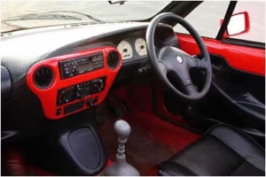
We help clients in these sectors design, engineer, and launch future-ready products.Automobile Vehicle and mobilityAutomobile Vehicle and mobility
End-to-end product and interface design for vehicles, systems, and mobility solutions.AviationAviation
Future-ready interiors and environments for aviation and next-gen air mobility.
Agriculture and ConstructionAgriculture and Construction
Design solutions for tough environments and tomorrow’s field-ready machines.ConsumerConsumer
Mass-market product design with a focus on form, function, and brand experience.Food and BeverageFood and Beverage
Packaging, experience, and system design for FMCG and food-tech brands.Health And Life SciencesHealth And Life Sciences
Human-centered design solutions for medtech, wellness, and everything in between.Industrial and Capital GoodsIndustrial and Capital Goods
Functional design and engineering for complex, high-performance industrial products.ManufacturingManufacturing
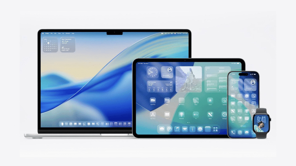
DFM-focused product design and system thinking for scalable, efficient production.TechnologyTechnology
Design for hardware, interfaces, and intelligent systems from concept to production.MarineMarine
Smart, scalable design for vessels, onboard systems, and immersive marine experiences.Space ExplorationSpace Exploration
Visualizing the frontier of space through compelling, human-centered design.
TelecommunicationTelecommunication
Shaping how the world connects through design-led communication systems. - About
- Insights
- Work
- Plans

Contact Us
Product
Impact Studio
Content X
India Strategy


