The Retail-to-Room Translation Problem
Consumer electronics have historically been designed for the thirty-foot view in big-box stores. High-contrast finishes, pulsing LED rings, and aggressive silhouettes move units off shelves. That same visual aggression becomes visual pollution in a domestic environment.
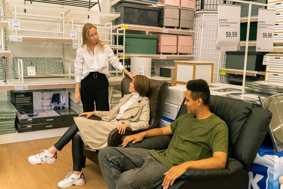
Photo by Antoni Shkraba Studio on Pexels
Samsung recognized this disconnect with The Frame television, which abandoned the black mirror aesthetic for matte finishes and ambient art mode. Products that fail this translation dominate the room like misplaced stage props—a device enters a home, it must surrender its retail presence or it colonizes the space.
The Neutrality Fallacy
Teams often mistake beige plastic for discretion. True neutral aesthetic product design requires understanding the room’s material temperature. Warm oak interiors reject cool white plastics. Concrete and steel spaces swallow soft-touch grey. The successful home-decor-friendly device matches the chromatic undertone of its surroundings, not just the hue.
This extends to surface texture. Brushed aluminum reads as appliance. Matte ceramic reads as object. Nest thermostats succeeded partly because the rounded zinc form felt like domestic hardware rather than HVAC controls. The material choice functions as a semantic signal about where the device belongs in the hierarchy of attention.
Shadow Behavior and Negative Space
Discreet appliance design depends on how the object occupies volume. Sharp edges cast distinct shadows that create visual noise. Thin profiles disappear until they do not, becoming blade-like intrusions against soft furnishings. The most successful home-friendly electronics design considers the silhouette against varied backgrounds throughout the day.
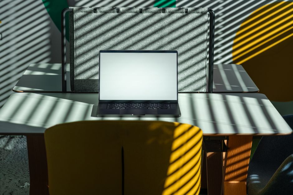
Photo by Jakub Zerdzicki on Pexels
Bang & Olufsen speakers often use woven fabric covers not merely for acoustic transparency but to soften the boundary between object and air. The device should absorb light rather than reflect it, creating a softer edge condition that lets the eye slide past. This requires modern interior hardware engineering to prioritize draft angles and wall-standoff distances that minimize shadow projection.
Engineering as Architectural Detail
Technical necessities become visual sabotage when handled poorly. Cooling vents read as gashes. Charging ports become interruptions. Status LEDs become intrusive light pollution in darkened rooms. The solution is not hiding these elements but treating them as joinery.
Consider how premium audio equipment uses perforated steel patterns that register as texture until inspected closely. Or how concealed cable routing transforms a power cord from a dangling afterthought into a deliberate design line. Every vent pattern, every seam tolerance, every indicator light must be translated into the vocabulary of furniture or architecture.