Health longevity companion that transforms wearable data into clear, adaptive insights across sleep, stress, recovery, and performance.
Guardian Health
Project Type
Product Strategy • UX/UI Design • Health & Wellness Platform
Stage
Concept-to-Scale Product Development
Services
The context
Guardian is a health-centric mobile experience that reimagines how physiological data is captured, interpreted, and surfaced to users. Instead of tracking isolated numbers, Guardian transforms wearable signals into meaningful, interpretable insights across three core life domains: Sleep, Stress, and Recovery.
The challenge
The rise of wearable tech has given users access to more biometric signals than ever before — yet most apps stop at charts, leaving users without context or meaning.
Guardian’s challenge was to elevate raw physiological data into a holistic longevity dashboard that feels intuitive, actionable, and reassuring.
The project demanded:
Guardian’s challenge was to elevate raw physiological data into a holistic longevity dashboard that feels intuitive, actionable, and reassuring.
The project demanded:
- A design language that supports complexity without clutter.
- System logic that unifies multi-device inputs (ring, watch, patch).
- Intelligent interpretation tailored to both daily use and longitudinal trends.
Sensors to Signals That Matter
Guardian was designed as a multi-device health system, integrating data from a ring, a watch, and a cardiac patch. Each device was selected for the signals it can capture reliably in everyday use.
Across these devices, Guardian works with a focused sensor stack:
- Accelerometer — movement and activity patterns
- HRM & PPG — heart rate and heart rate variability
- EDA — physiological stress response
- SpO₂ — oxygen saturation trends
- Skin Temperature — circadian and recovery cues
These sensors translate into physiological metrics that are feasible to track and meaningful over time—sleep stages, HRV, resting heart rate, stress load, cadence, stroke efficiency, and recovery indicators.
To avoid metric overload, all signals are intentionally aggregated into three core health pillars:
- Sleep — restoration, circadian stability, and sleep quality
- Stress — acute and chronic physiological load
- Recovery — adaptation, fatigue, and readiness
This structure keeps the system understandable without oversimplifying it.
Sensors feed metrics. Metrics feed domains. Domains feed insights.
Users never have to think about which device tracked what—only how their body is responding over time.
UX Philosophy
Across Guardian, the UX philosophy prioritizes meaning over measurement. Interpretation always precedes visualization, ensuring users understand why a metric matters before engaging with the data itself. Each screen focuses on a single primary signal to reduce cognitive load and elevate clarity, while recommendations are framed as supportive and contextual guidance rather than prescriptive alerts, maintaining a calm and reassuring experience.
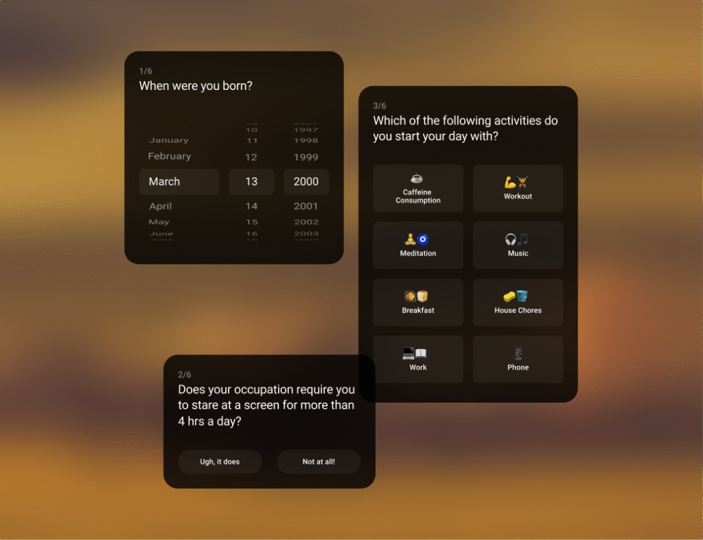
System That Learns Your Body From Day One
Guardian’s onboarding is designed to establish trust and accuracy without friction. The experience leads with a clear, step-by-step device setup—charging, Bluetooth pairing, device confirmation, and correct wear—focusing on details that directly impact data quality, such as fit and placement. Clear progress states and calm success feedback keep the process reassuring, framing Guardian as a dependable health companion rather than a technical setup flow.
Once devices are connected, onboarding shifts to understanding daily context. A short questionnaire captures age, work patterns, and routines across the start, middle, and end of the day. These inputs provide essential context for interpreting future trends and anomalies, without positioning the experience as medical or diagnostic. The result is a personalized foundation that feels lightweight, human, and easy to complete.
A Single View of What Matters Most
Guardian’s home was designed as a synthesis layer rather than a data dashboard. Early exploration showed that presenting all metrics together diluted their meaning, so the interface deliberately organizes health data into three domains—Sleep, Stress, and Recovery—each representing a distinct physiological state. This structure mirrors how the body behaves over time: sleep restores, stress accumulates, and recovery determines readiness. The Overview tab surfaces balance across these domains, while individual tabs allow focused attention without losing context.
Each layout follows a clear hierarchy that prioritizes interpretation over inspection. A single primary score anchors the screen, followed by narrative insights and supporting metrics, with trends and history kept secondary. Guardian also incorporates contextual prompts that invite user input at meaningful moments—such as improvements or anomalies—helping users reflect on cause and effect while feeding qualitative context back into the system. Over time, this loop allows Guardian to better understand individual patterns, turning the home experience into an adaptive conversation rather than a static display.
Sport-Specific Insights
Guardian’s post-workout experience is built on the understanding that different activities stress the body in different ways. Instead of applying a single metric set across all workouts, each sport—biking, running, and swimming—has its own interpretation layer. Metrics are chosen based on relevance: power and elevation for biking, pace and cadence for running, and stroke efficiency, turn time, and SWOLF for swimming. This ensures workouts are explained through signals that actually reflect performance, not just what is easy to capture.
Each flow follows a consistent three-lens structure—Performance, Efficiency/Form, and Recovery—balancing familiarity with depth. Visually, layouts prioritize one dominant insight at a time, supported by focused graphs and restrained color to highlight meaningful thresholds. Narrative insights and recovery cues help users reflect on effort and cost, turning each workout into a clearer understanding of how their body responds and adapts over time.
Design System
Across screens, the design system emphasizes clarity under complexity through a single primary focus and a clearly defined score hierarchy. A consistent vertical rhythm and information cadence guide attention naturally, while a dark, reflective visual tone supports introspection and sustained use. Color is applied sparingly and purposefully to encode meaningful thresholds, and reusable components—such as score rings, metric cards, and insight blocks—ensure coherence and scalability across the experience.
The outcome
Guardian reframes biometric tracking into meaningful health narratives by helping users understand why metrics matter, not just what they represent. Sport summaries read like analyst insights rather than generic achievement badges, while domain-based grouping reinforces a long-term health perspective over short-term gamification. Design plays a central role in translating complex sensor data into familiar, digestible experiences, bridging the gap between physiology and everyday life.
See all plans
Get in touch with us
More Case Studies
Oakter for Carvaan
•
August 21, 2024
The LEGO GaN Charger
•
July 1, 2024
Oakter for ElectricPe
•
June 26, 2024
Catcher Grizzly
•
May 23, 2024